World Ocean Initiative – The Economist
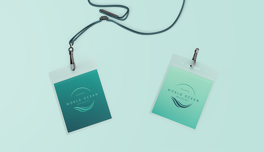
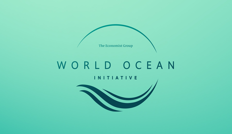
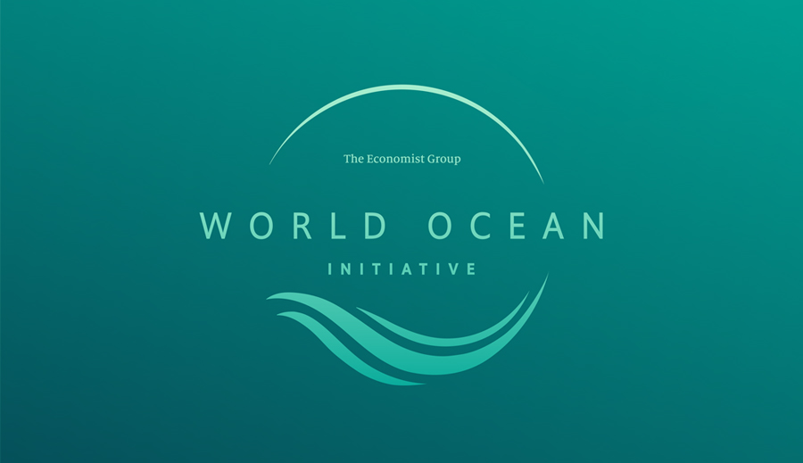
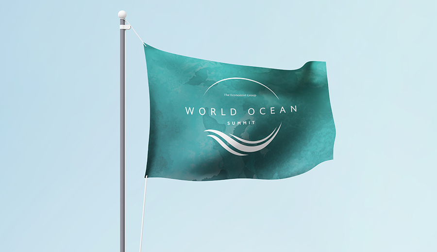
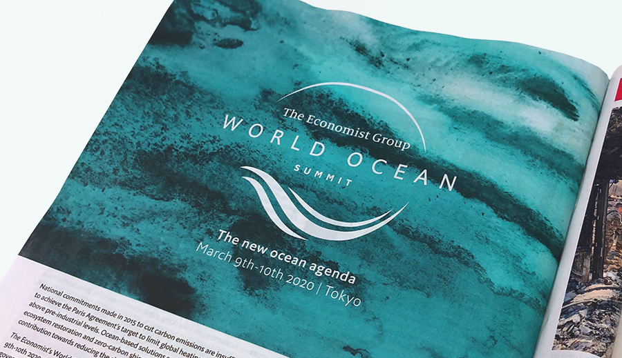
World Ocean were looking to update their branding and consolidate both their Initiative and Summit into a set of interchangeable brand marks, that would stand out from their competitors.
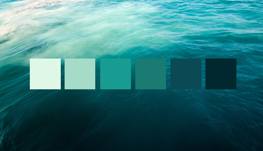
The natural hues and gradients within the ocean brings a beautiful opportunity to use a turquoise brand palette. Starting from the vibrant turquoises at the surface, and diving deep to the richer, darker tones below. Representative of how World Ocean is surfacing the big issues, and diving deeper into the complex. While the band mark itself give World Ocean a more contemporary and sophisticated feel.